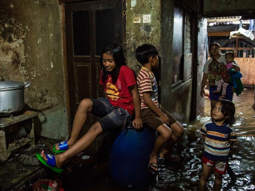
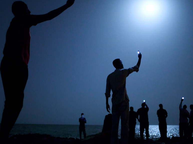
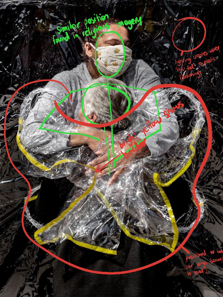
Press Photo
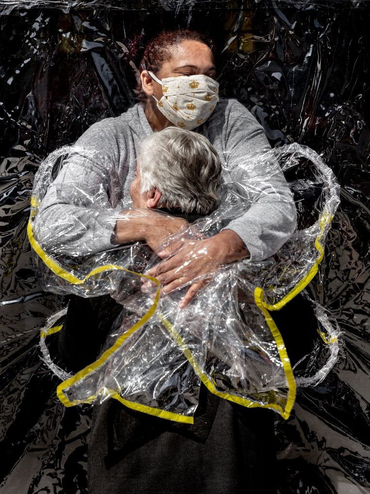
"The First Embrace" by Mads Nissen
Final Installation
what I Learned
Through this project, I learned four main things. After Effects, think of all possible audiences, the balance of sound and how to pan the audio, and sometimes, clarity is just as good as abstraction.
I'm actually a lot better at after effects than I thought, I had done the basics in my course in Ireland but I had avoided it after I learnt that in my first year as the way I had been taught made me hate the software. After refreshing the basics in a new way I was actually able to learn how to do some really creative and really cool things, this included different effects, and changing the type of keyframe to change the way the elements animate. I also learned how to use gradients and how to change their appearance mid-animation.
Make sure to think about the audience, and don't forget there are other people there if they are other people observing the installation to make sure they can experience it in a way that they are not hugely missing out.
One of the things I wanted to improve on through this minor By watching and learning from Shaquille editing the audio, I learned how to make audio tracks well balanced. That by emphasising some audio tracks and making others more subtle, you can elevate the overall as the subtle tracks elevate the more obvious ones. He also showed me how to edit audio so that some tracks pan from one speaker to another in premiere pro.
Lastly, I learned that sometimes making one thing very obvious in your installation, can really elevate the more abstract elements. I originally was under the belief that having art that can be interrupted in many ways for each individual person but after the feedback we received over the last three installations, I have realised that if people are too confused they won't enjoy it as much
Week 1
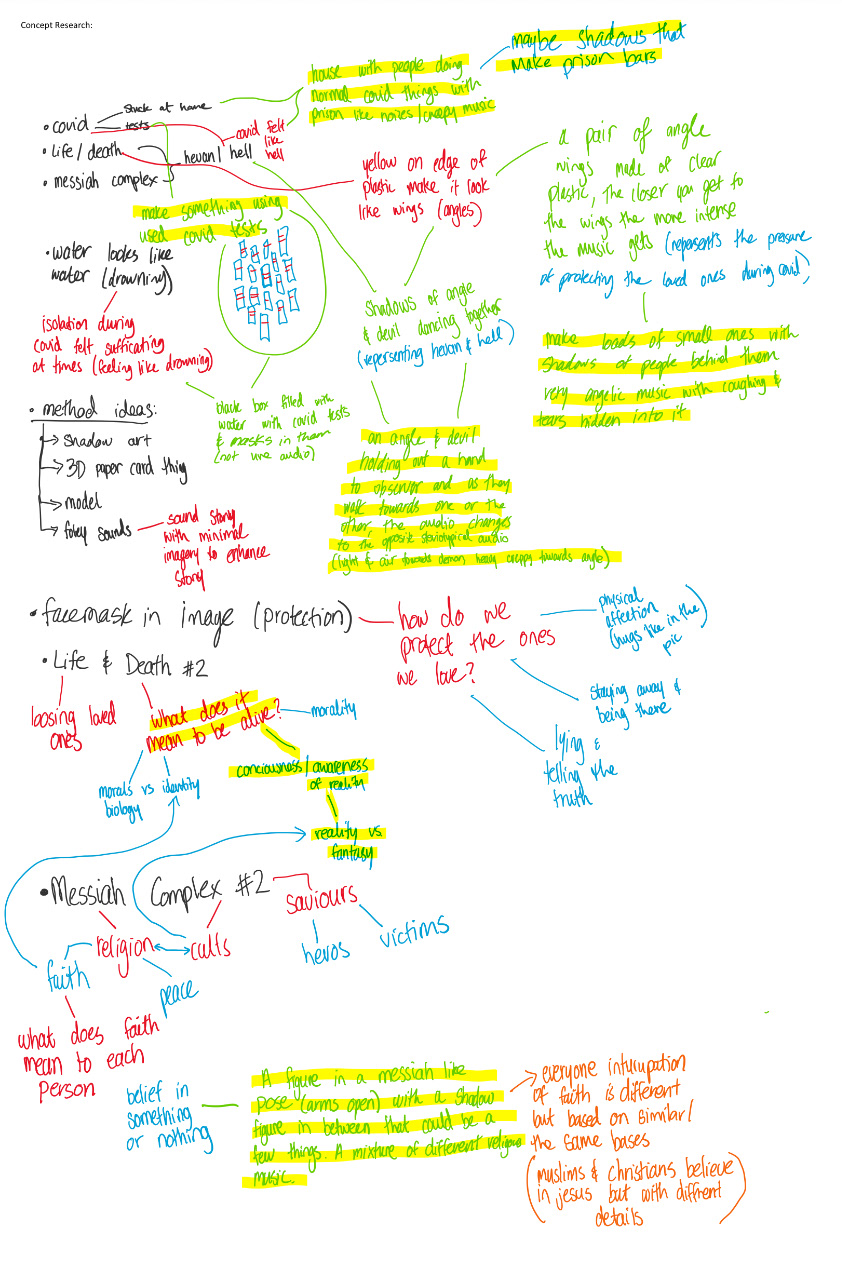
The first thing I did was analyse the photo. Here is what I came up with
Here is some concept research I did for this project:
We had a meeting online on Monday the 12th and we finalised our concept.
Link to some brainstorming and story development we did: https://jamboard.google.com/d/1tWgwel0RTB4P8T1k-wbEIdhjAZKWHtTCbKqX3DP12So/edit?usp=sharing (screenshots provided in case link doesn't work)
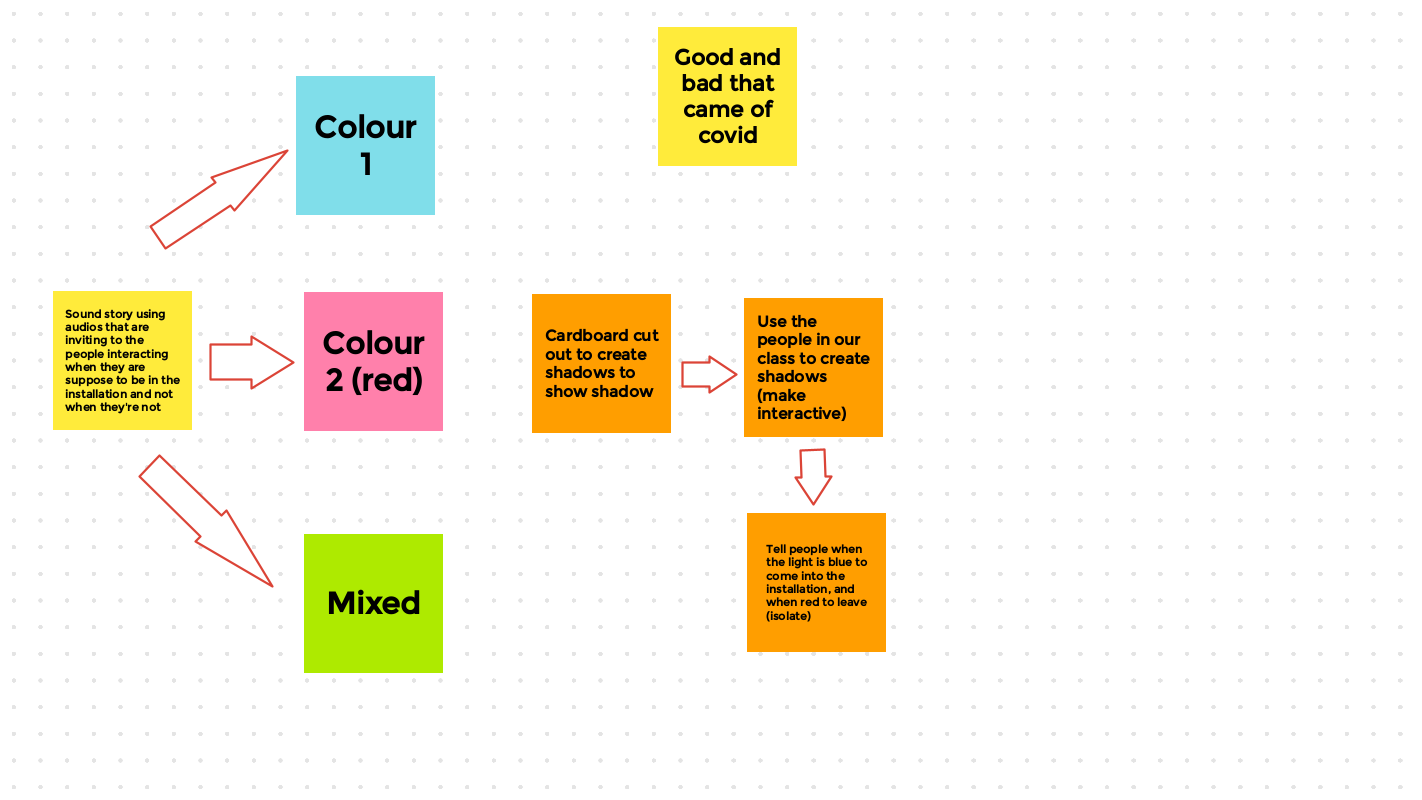
We decided on being more literal with COVID but portraying this typical story in a more generic way. We are going to use three colours (two lamps) Blue, which represents life before covid, Red, which represents life during covid, and Purple, which represents the new hybrid life we have after covid. We going to create a sound story that helps our audience understand the story. We hope to use sounds from nightclubs and festivals as well as coughing, empty/white noise, etc. The thing we hope that makes our piece stand out compared to others in our class is we hope to make it interactive by having our audience create shadows to represent the people living during the COVID-19 pandemic
I am going to go to ACTION today to buy simple RGB light bulbs and tomorrow I am bringing in my tripod and the bulbs to start working on our piece. Floor is going to bring her bulb adapters, Shaquille is bringing his headphones and tripod, and Charlie is bringing a white sheet. We're going to work more on our sound story and how it will actually work in class tomorrow.
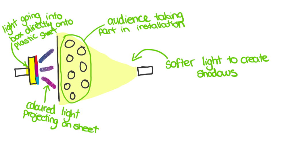
We were not able to get the bulbs so we went with a more analogue version. We got coloured plastic and placed it in front of a light source. By keeping the plastic stationery and moving the backlight we were able to create a beautiful transition and colour blending which was an important concept. We did learn that we needed a bright light source and we also built a map box out of a shoe box to direct the light better and stop any plain light from hitting the cloth we are using from projection. We are also planning to place a softer light in front of the sheet with a neutral light colour to create shadows for the audience on our sheet
Here are some videos I took during our problem-solving time after class today
Here is a sketch of the layout we have planned
Presentation #1:
This is what our project looked like when we presented. We changed our idea on the day as we noticed we got better colour by having the light in front of the sheet. Also by using two lights we created a cool effect with two different colour shadows at one time. We then manually turned the lights on and off in time with the audio. You can also find the completed audio below
Feedback from Analog Presentation:
- More colours
- More immersive
- Clarify audio (maybe more subjective audios)
- Projection mapping
- Use more speakers and try and put the audio more where the person is (surround sound?)


Week 2
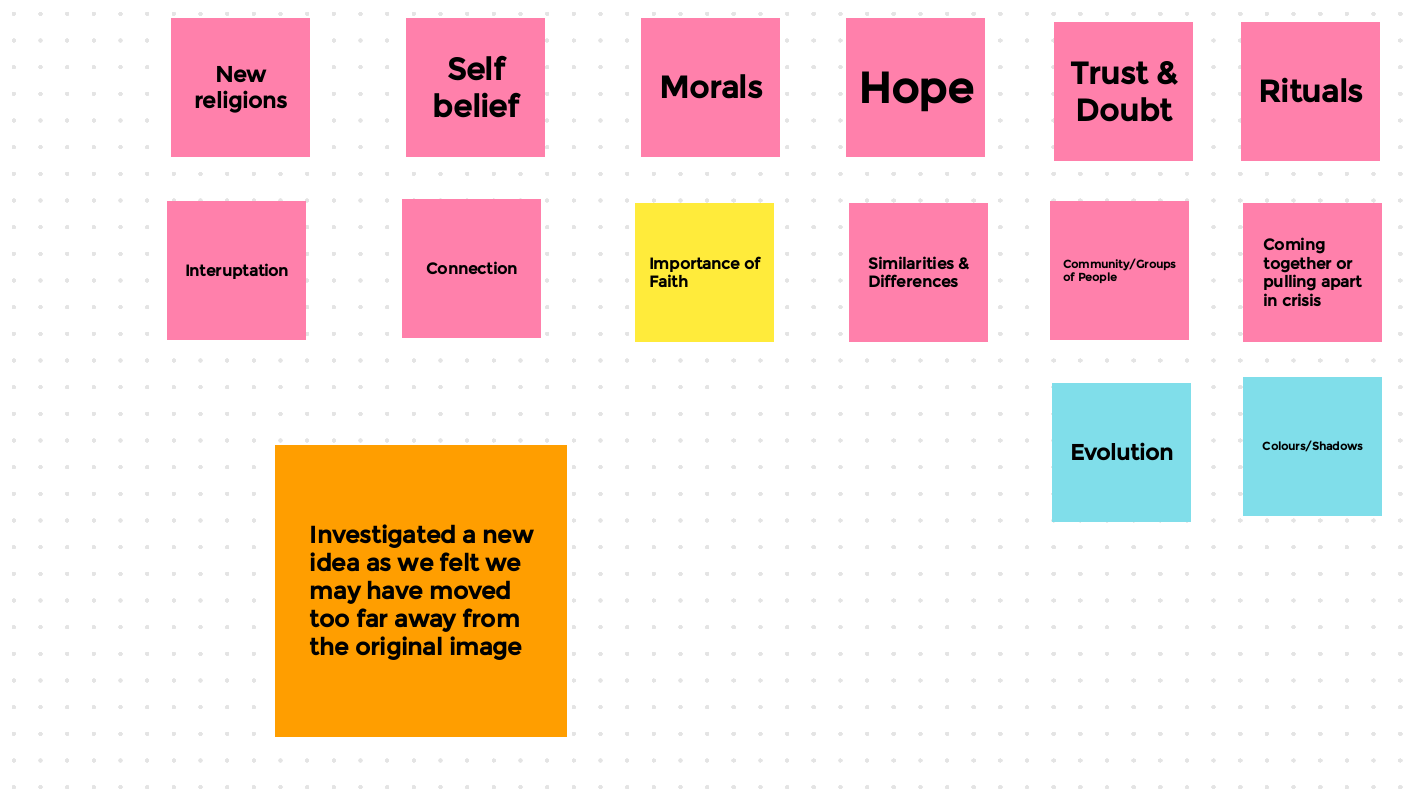
I came up with an idea based on the feedback we received. What if we made our project about juggling the elements of their life (family, hobbies, religion, identity) Make it like OseanWorld installation where we're going through a fast-paced rollercoaster. Loads of different colours
We booked the green room on Tuesday and Thursday to work on our project
We decided to go with the theme of different aspects of identity and that point in life where you try and keep all these aspects separate as if the other elements "meet each other" and everything could be ruined. Then we reach this point in our lives where we figure out that the world isn't going to care so be all the elements of yourself at once
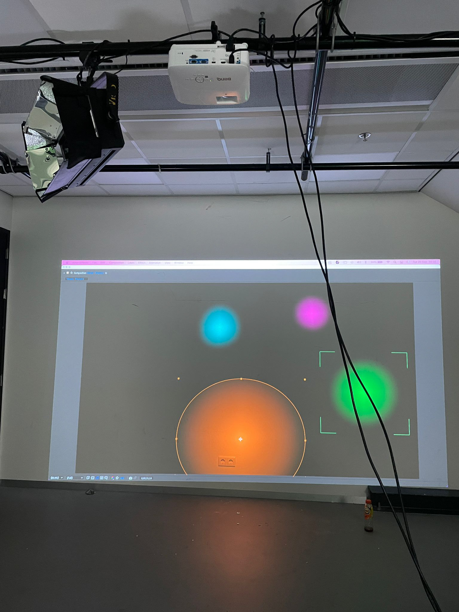
I was struggling to find an easy way to make the lights flicker so I did some research and was reminded of something I learned in my college in Ireland. By using CSS animation with after effects I was able to create a continuous shake/flicker/pulse in each individual colour
I change the way I did it a few times but here is as far as/the first draft I made today
We started with the work I had done in the first draft, we projected it onto the wall and realised our concept would work better on just one wall with all the lights off
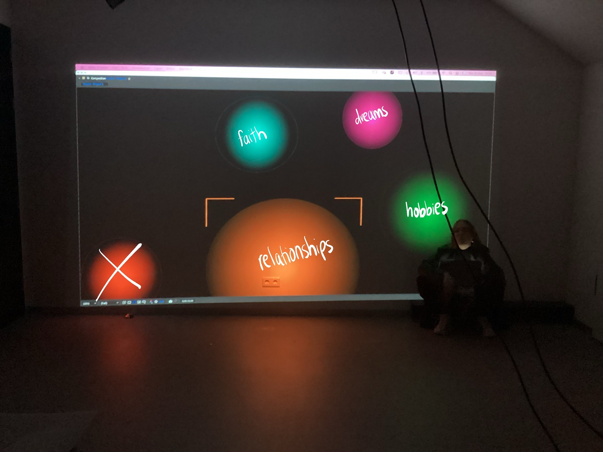
We started to decide which colours represented an element of our identity and this is what we came to
We then started to play around with the visuals to make sure they had a clear story
We decided to have symbols escape the colours when they are all being introduced, so I finished the main story and Shaquille is going to add the icons
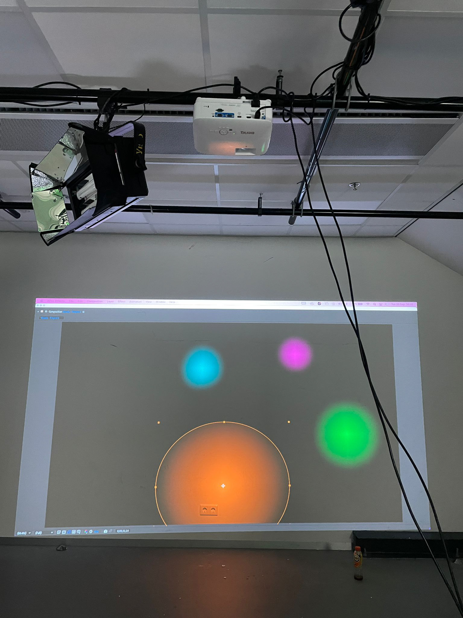
Here is the completed visuals for our digital project for Presentation #2
Presentation #2:
We presented our MidFi projects today. We set up the audio and made sure there was panning
When the set-up was complete this is what the installation looked like
Here is some of the feedback we received:
Tim: visitor (interacting)
Audiovisual worked well - 11
Didn’t get all - 10
Colours made it immersive- everyone
Jannico: visitor
Really like silhoutte- 11
Colours connected with emotions, going from one emotion to another - 1
Gave different dimensions, worlds coming together -
The audio was overwhelming but good - everyone
Cristina: classmate
Visuals are really good - 15
The story was confusing - everyone
The sound story was better last time better, make it more like that - 9
Max: visitor
Silhouette makes you feel like in - 7
ADHD made it soothing was recognisable - 5
Birthday was confused (audio) - 9
Rick: classmate
Really good use of the room - everyone
Balance sound better - 6
Abstract colours worked well with sound but the audio was not clear - 11
Happy birthday could be left out or used better - 14
Kylian:
Visuals flickering made it better - 13
The numbers/"everyone" was the number of people who agreed with the statement made.
We were asked to then take this advice and make some changes to our project in an hour. We added audios of us saying what the colours meant, made the spinning lights last a little longer (at the recommendation of our partner group) and moved the speakers to be behind the person in the installation. The video on the left is how these modifications
For next week we hope to blend the words together when the colours bash into each other around the screen so we can represent in inner turmoil better
Week 3
Today we presented the final version of our project. We named this installation, "identity"