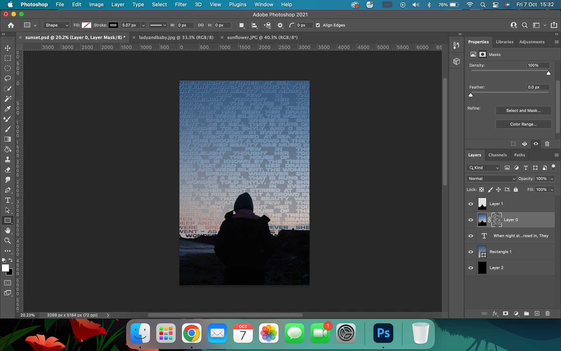
Finished Piece
What I learned
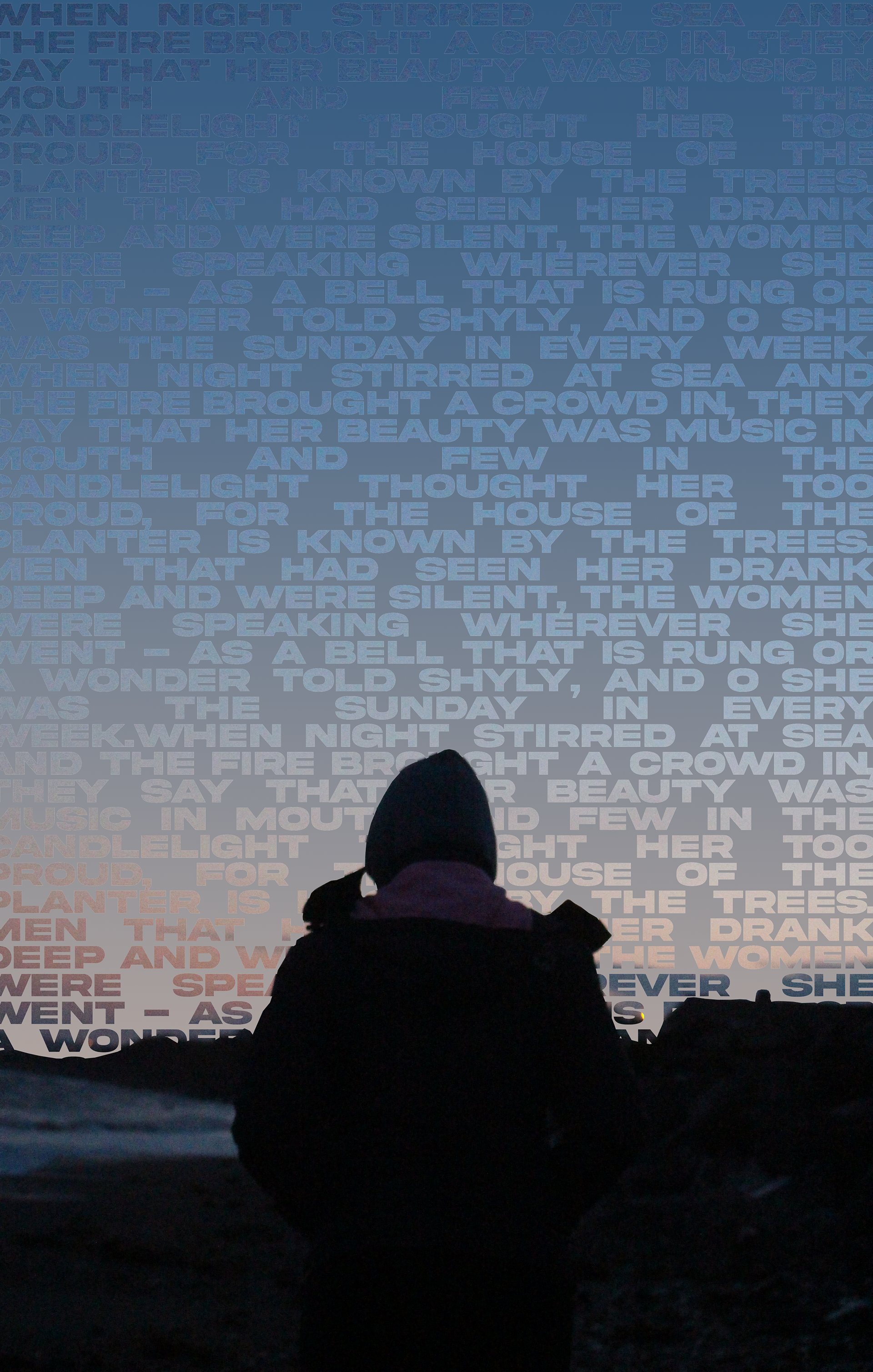
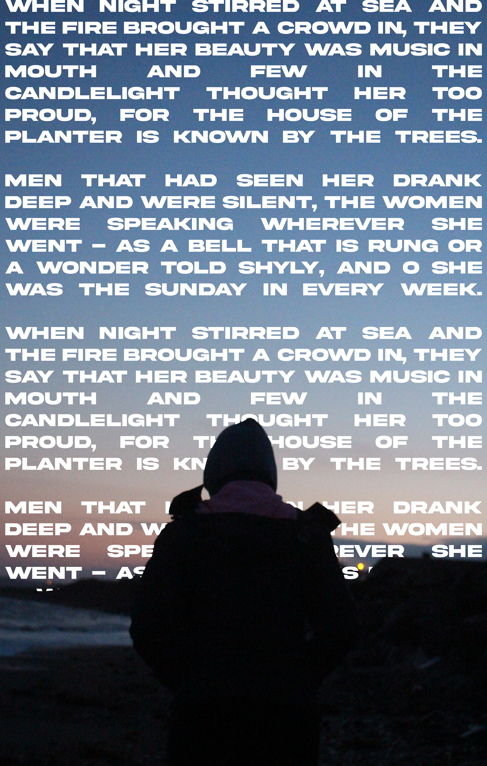
Through using typography I wanted to make this calm, serene image loud and full. By using this image of my younger sister walking on the beach near our home in Ireland and inserting the poem, "The Planter's Daughter," by Austin Clark, a poem about the importance of a woman's voice, it built the sense of volume and taking up space, unlike the original photo.
During the process of creating this piece, I learned a lot about balance and photoshop tools.
I learned that when creating a piece of art like this you can't allow one element to overpower the other (unless that is the point of your art) I realised this many times during this process. Mainly when I was trying to balance the thickness of the font to include enough of the sky, how much text and how densely I had that text in the image, the colour of the font I used, etc. I really focused on it however when it came to the background colour once I had the font masking the original sunset in the image. I spent a lot of time playing with the gradient underneath and the border on the font so that the text was visible enough that it could be read, but not so obvious that it took away from the photo itself and take away from the girl who was walking it. I also didn't want the photo itself to hide the text as it helps emphasise the themes of identity and speaking out that I felt this photo conveyed.
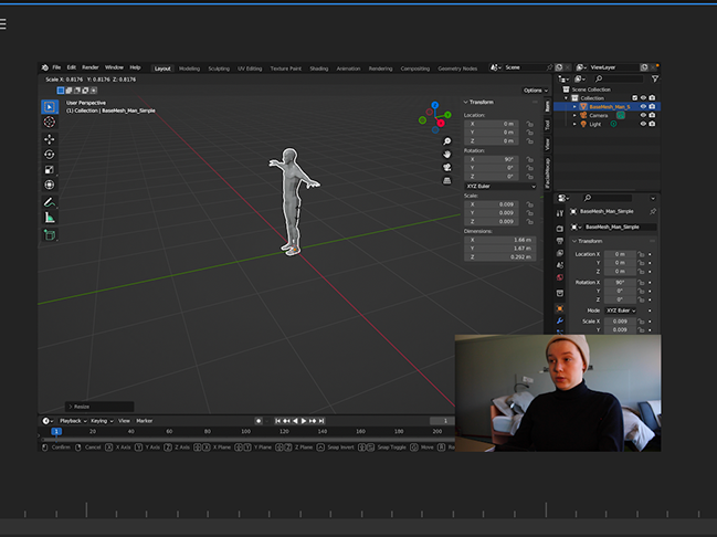
I also learned a lot about masking and feathering tools in photoshop. I learned that by holding alt when you click on a layer, it will select everything on the layer. You can then turn it into a mask for whatever is above it by selecting the option at the very bottom of the layers box that looked like a white rectangle with a circle cut out of the middle. I also learned how with the Text Tool, to select your text and press Command + A to highlight all. Hold Command and click and drag your text to the inside of your shape. This will automatically shift your text to wrap around the inside edge of your shape. I used both these tools when trying to put text inside the silhouette and in the sky. I can now use these skills in the future for more typography or graphic design I make in the future as well as utilise this during the minor
Creative Research
Inspiration:
The first thing I did was research what styles and typography. I had only briefly looked into typography art in the past, I had previously done assignments to create campaign posters and vector portraits that included text in them, but never something specific like this.
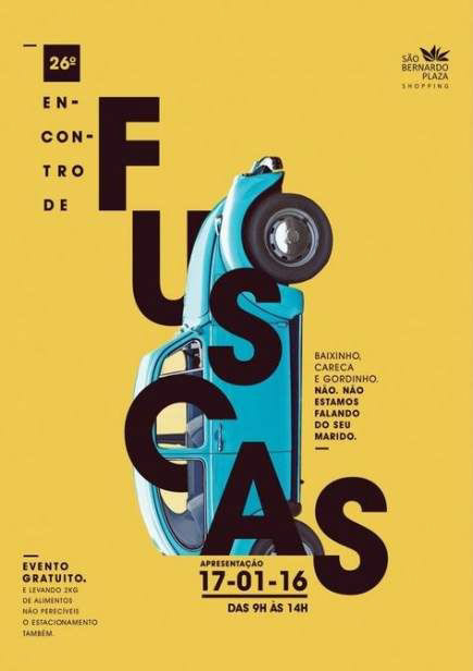
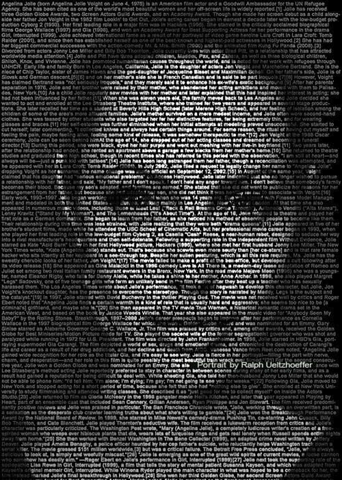
From the research, I did I really liked the warping of words/letters as well as the building of the text into the image. My favourites included the Saó Bernardo Plaza event poster and the Angelina Jolie portrait as they incorporated what I said previous as well as having a great balance between the importance of the image and the words, generating beautiful art.


Selecting Imagery to Work With:
I really wanted to incorporate my own photography into my work. I wanted to see if I could accentuate my work through the use of typography and learn more about image editing to enhance my digital art skills.
So I proceed I looked through my photo archive from projects and commissions I had done previously. These photos included photos in the snow, of family, in a sunflower field, etc. The reason I choose this selection of photos is that I thought the shapes and colours in them were dynamic and bold enough to hold their own when the text was added. That the text and imagery would balance and enhance one another perfectly.

This is the photo I decided to work with. I thought the silhouette in the image could allow for some interesting use of shape when it comes to using letters. I also wanted to take the feeling of calm and peace I feel this photo depicts and shift the context for it to be more loud and chaotic. Similar to mental health, activists give passionate speeches, and when you come home after a crazy day.
Script Research:
I also looked into themes I could incorporate into the piece. The first that came to mind looking at the photos I selected were family, mental health, music, and identity. I decided to use identity in regard to gender inequality, Irish heritage, etc.
I decided to go through Irish poetry to find something that would suit the two themes I went with and also the underline topics I wanted to portray. Some of these artists included Adrienne Rich, William B. Yeats, Oscar Wilde, and Eavan Boland. In the end, I went with Austin Clark. I decided to go with this poet as he has been very open about his own mental health issues; discussing it in his poetry while also talking about Irish women's history and how they gained rights. Some poems I liked included, "The Awakening Of Dermuid," "The Lost Heifer," and "Healing" however, the poem I went with was, "The Planter's Daughter."
This is how the poem reads:
The Planter's Daughter:
Austin Clark
When night stirred at sea
And the fire brought a crowd in,
They say that her beauty
Was music in mouth
And few in the candlelight
Thought her too proud,
For the house of the planter
Is known by the trees.
When night stirred at sea
And the fire brought a crowd in,
They say that her beauty
Was music in mouth
And few in the candlelight
Thought her too proud,
For the house of the planter
Is known by the trees.
Men that had seen her
Drank deep and were silent,
The women were speaking
Wherever she went -
As a bell that is rung
Or a wonder told shyly,
And O she was the Sunday
In every week.
Drank deep and were silent,
The women were speaking
Wherever she went -
As a bell that is rung
Or a wonder told shyly,
And O she was the Sunday
In every week.
I chose this piece because I felt it spoke about appearance vs. reality. How women are seen in society to be soft and passive, where in reality, some of the loudest, strongest, and toughest people I know are women. It also spoke about the importance of a woman's voice. I think it talks about the importance of women's rights and having control and autonomy over the things in their lives.
creative Process
I started by taking the photo into photoshop. I started by trying to outline the body and put the poem into that but I didn't like the way it spaced itself. I also felt it took too much focus from the person and more on the words. I wanted there to have an even balance between the two.
I then decided I wanted to do something with the sky without taking away the sunset from the image. I started by putting the poem into a block-of-text form by using justifying, line spacing, and character size/font. I placed this from the very top of the image to where the land and sky meet. I then used the lasso tool with a 50px feather to cut out the land and girl in the picture and copy/paste them onto a new layer. By placing this new silhouette on top of the text layer, it created the effect that the text was in the sky.
I did like this but I felt again, the text was becoming more important than the image and I wanted to create a nice balance.
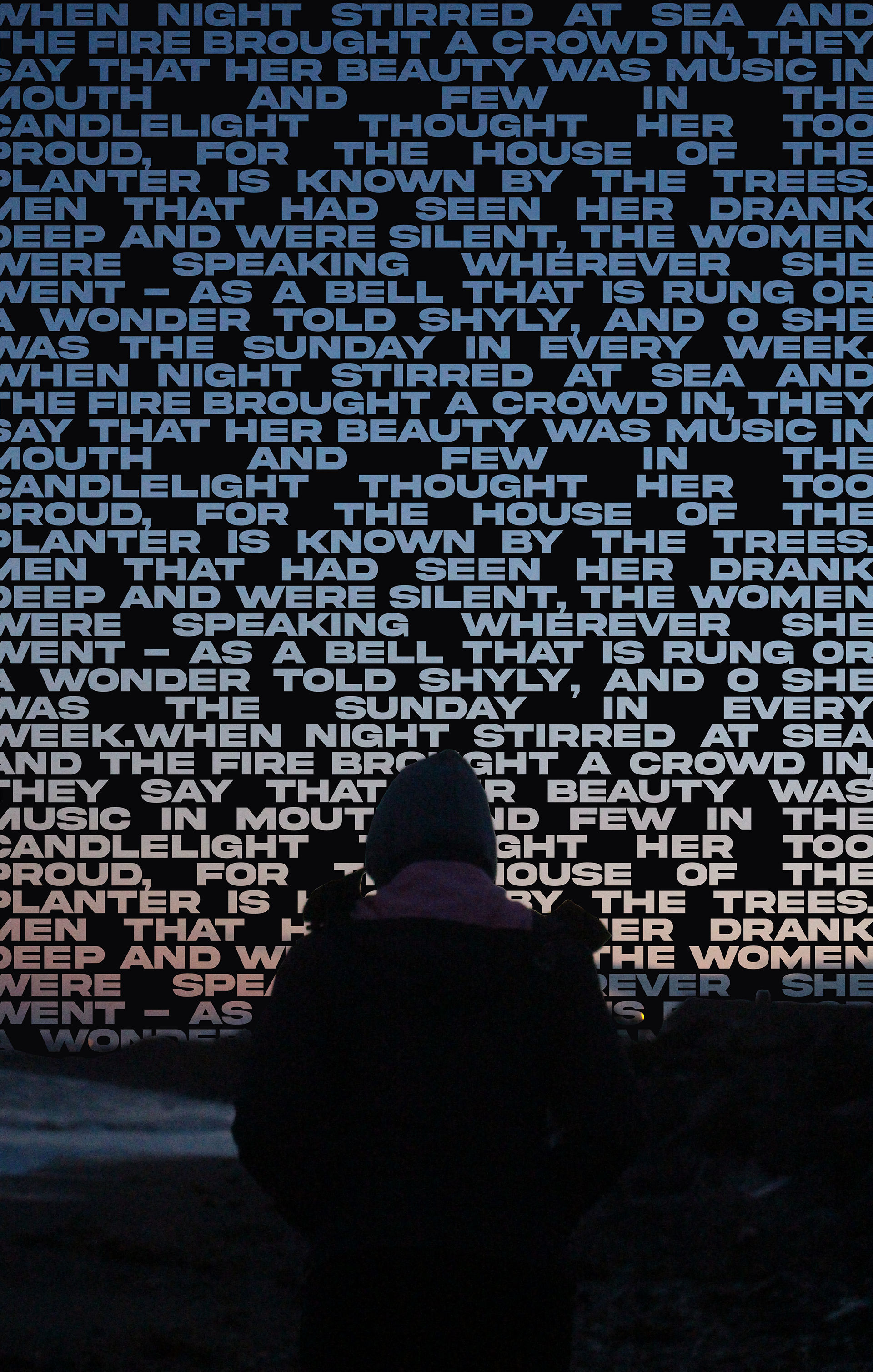
I then continued to experiment with masking and what I could do with that. I learned through research that I could use the text as a mask. I did this to make the text of the poetry filled from the sunset in the sky. This however left a transparent background. I added a black background to bring emphasis to the sunset text.
I however felt, again, the balance was off and continued to play with new backgrounds. Eventually, I came up with the idea to use a gradient with colours from the sunset. This gave it a blended-in look while still keeping the text clear.
To complete the piece I changed the border of the letters to match the background colours. This blended the texting in the background a bit too much. I then switched it to black and it gave it a great definition while also staying part of the sky.